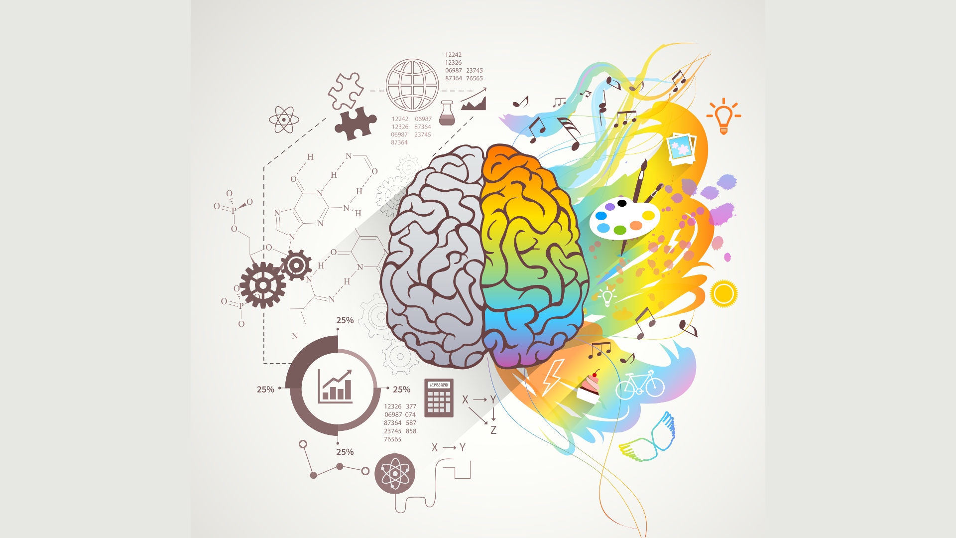
When it comes to designing a website, one of the most important decisions you will make is choosing the colors. While it might seem like a small decision, the colors you choose can make all the difference in how your site is perceived. Color psychology is the study of how color affects human behavior and can be used to evoke emotions. In this post, we’ll explore the principles of color psychology and how to use them to create an emotional connection with your users through your website’s palette.
Before utilizing color psychology in web design, it’s important to understand the meanings associated with each color. Red signifies passion, energy, and excitement while blue evokes feelings of peace, trust, and confidence. Yellow represents happiness, optimism, and creativity while green is often associated with growth, nature, and relaxation. Knowing these basic color meanings can help you to choose hues that will best communicate the desired message.
Complementary colors are those that sit opposite each other on the color wheel, such as blue and orange, green and red, or yellow and purple. When used together on a website, complementary colors create a striking visual effect that can evoke strong emotional responses. For example, red and green are complementary colors that can bring images of Christmas and the holiday season.
When selecting a color palette for your website, it’s important to consider your branding. Keeping brand consistency is important as strong branding can lead to better customer recognition, loyalty, and retention. Try choosing dominant colors from your logo to create a cohesive feel that is instantly recognizable to visitors.
Colors can have different meanings in different cultures. For example, in Western cultures white represents purity and weddings, but in some Eastern cultures, it is the color of mourning. Red is a well-known symbol of good luck in Chinese culture, while in Turkey, it represents danger. Be sure to research and be mindful of cultural differences when designing for a global audience.
Finally, it’s important to balance contrast when selecting your color palette. Similar colors may not contrast enough, making your website design feel dull or less engaging. On the other hand, too much contrast can cause visual fatigue and make the design appear too busy. Consider adjusting the saturation of colors or trying color pairing websites to find the colors that work best for your aesthetic.
In conclusion, color psychology can be a powerful tool in web design that can evoke emotions and create a lasting impression on users. When choosing a palette, it’s important to consider the meaning behind each color, use complementary colors, remain consistent with branding, consider cultural differences, and balance contrast for a visually pleasing design. By understanding and implementing the principles of color psychology, you can create a website that connects with your users on a deep, emotional level.